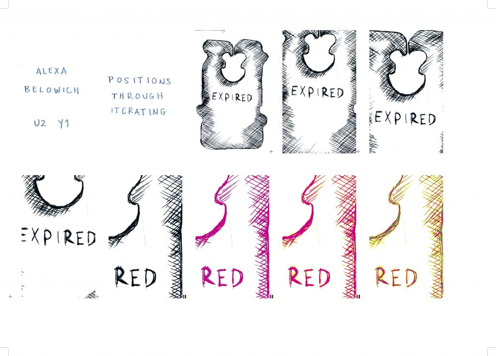
Work completed during Positions through Iterating led to a developing critical inquiry of exploring materiality of human-made representations of inconspicuous commercial objects through printmaking and digital graphic design processes.
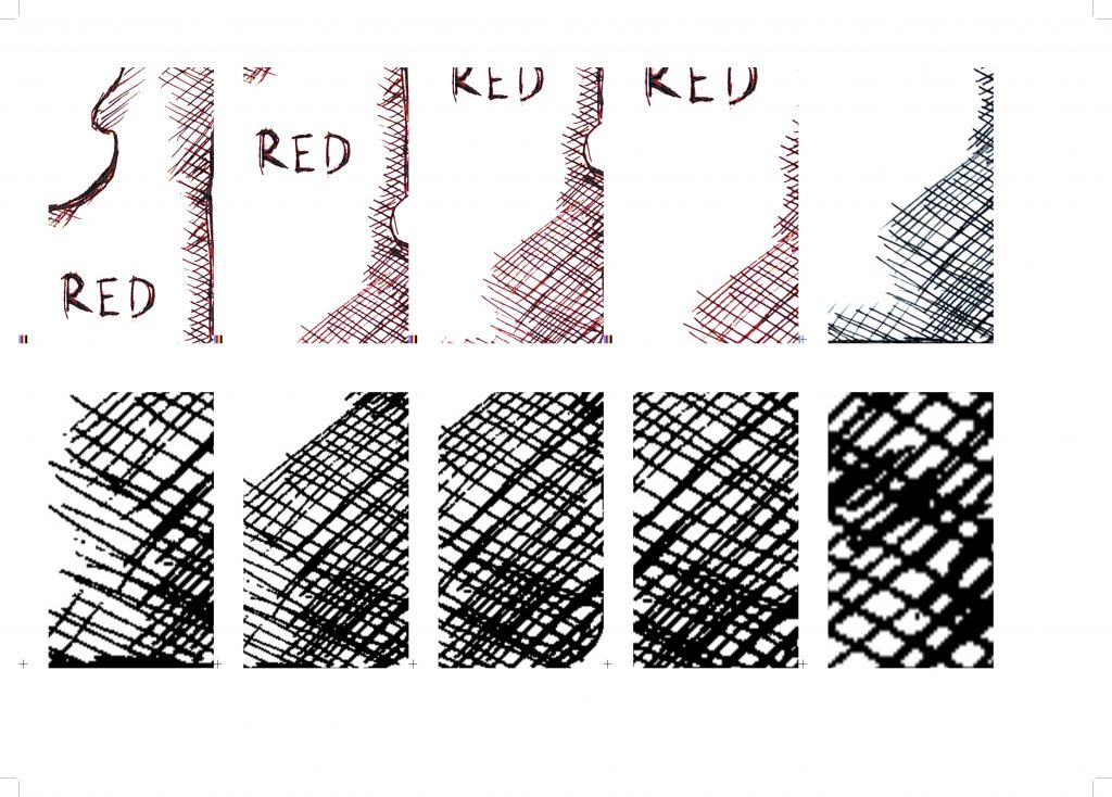
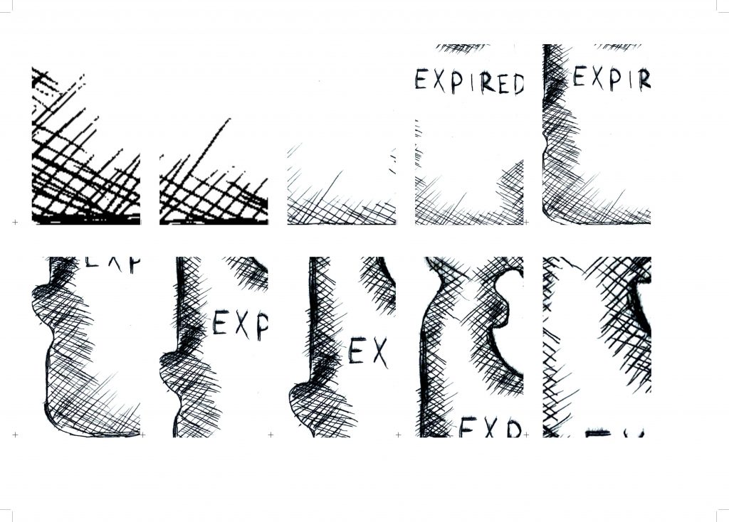
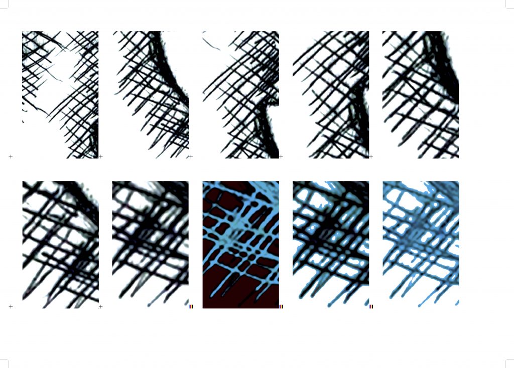
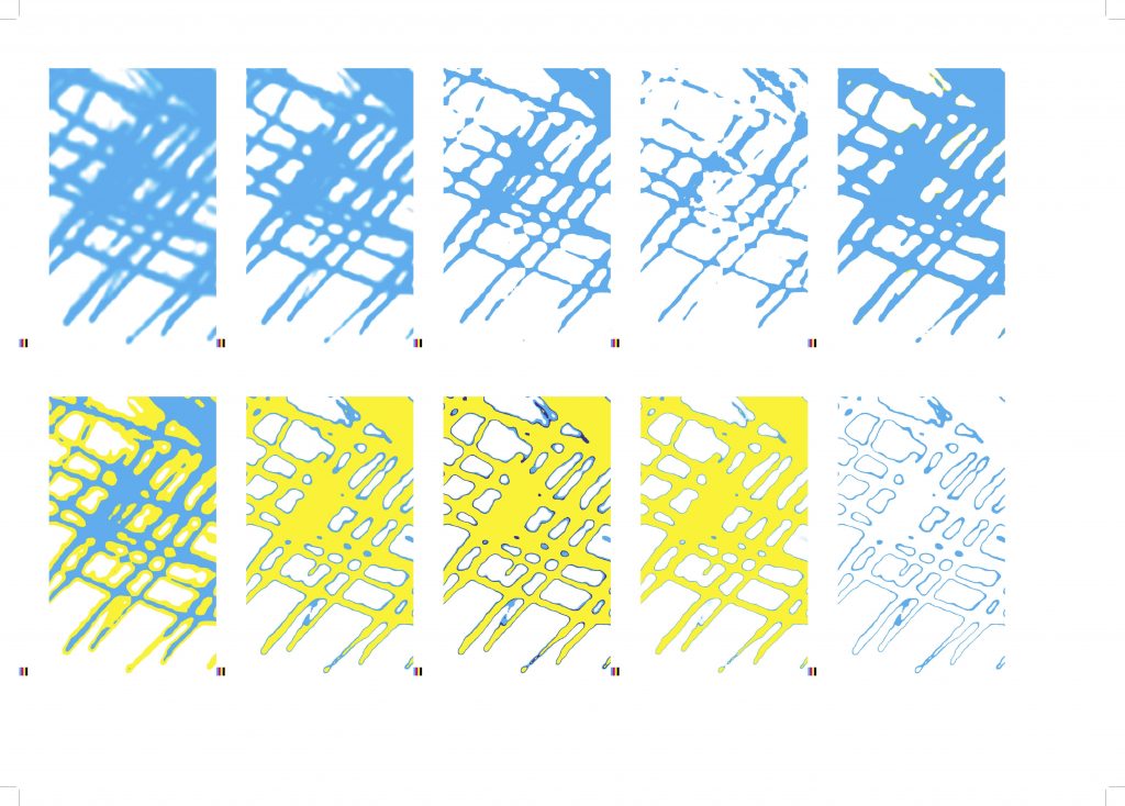
Iterations were developed through the process of scanning a set of etchings that were created during Methods of Iterating and applying digital alterations. Methodology for image manipulation includes duplication and layering CMYK colors as a means of controlling contrast and clarity. Symbolically, the introduction of bright hues is meant to reflect the physical object’s material toxicity which is mirrored in the plastic binding. Scale too became a critical variable in developing new compositions, as digital distortion results in pixelation and abstract forms. The second series of iterations is based on a single image as input, rather than a set, with the intention on extending the life of a print that would otherwise be static once the ink dries. The publication is more intentional in sequentially moving through parts of a whole picture with the inclusion of symbols ( +; | ) or CMYK registration marks as an instruction of how that frame was altered.
References
Ivins, W. M. (1969) ‘New Reports and New Vision in the Nineteenth Century’, in Prints and Visual Communication. Cambridge, Massachusetts: The MIT Press, pp. 135–153.
Prints and Visual Communication served as a useful reference in situating my practice of image making in the history of printmaking and digital processes in publications. Historically, the value of an image is based on its relation to text and its medium, according to Ivins. Mainly the illustration or print served as a supplement for text, needing to “‘harmonize’ with the printed text pages and [not to] attract attention to themselves or interfere with the balance of the blocks of type” (30). My iterations contradict this thought by focusing on image rather than text as a means of non-verbal communication. Ivins claims that the picture’s value is tied to the surface it appears on along with the handmade marks lend themselves to its conception. I explored the human markings that originate in the first iteration by abstraction through scale and color. Although the medium in which the image exists is technically digitally flattened, the flexibility of digital tools allow for the print to exist in multiple states. In terms of my iterations, according to Ivins, the original etching is the most authentic and as the etching is digitized, it loses its meaning and value.
Walkup, K. (2020) ‘The Book as a Pot-Luck Offering: Edna Beilenson, Jane Grabhorn & Books of the Distaff Side ’, in Natural Enemies of Books: A Messy History of Women in Printing and Typography. Grafikens Hus, pp. 25–50.
In The Book as a Pot-Luck Offering, Kathleen Walkup investigates the formal properties of Bookmaking on the Distaff Side beginning with physical materials. The signatures vary in size and are comprised of a collection of paper materials while the book’s cover omits the names of individual authors or publishers, rather citing themselves as a group. The ad-hoc approach to the publication’s construction is largely due to the women’s technical limitations due to nineteenth century socioeconomics. My iterations follow The Committee’s narrative of self-publishing on a small scale as a means of demonstrating authenticity. Additionally, I draw on the use of non-uniform typography with the use of handwriting, though methodology and tools differ.
Boom, I., Leyman, D. and Lake, H. (2016) The best book designs from the Netherlands and Flanders 2015 = De Best Verzorgde Boeken Van Neerland en vlaanderen 2015. Amsterdam: Stichting De Best Verzorgde Boeken, Stichting Collectieve Propaganda van het Nederlandse Boek.
Like Re-Printed Matter, this reference highlights the materiality of books but through physical material rather than printing processes. Most significant to the book’s physical nature is the choice of printing pages single sided onto thin, nearly transparent paper. Where there would traditionally be a separation of information from page to page, the transparency creates a cloud of image and text that work in conjunction to form fluid compositions. Paper type and the use of full bleed images causes white space to become grey space that is extended to the sides of the book. In regards to my iterations, setting limitations for margins allows creates a similar grey space along the side of the book, extending the life of the image. The main impact of is that it led me to question how to mimic the materiality of content with the construction of the publication itself in regards to cover material and binding.
Martens, K., Kinross, R. and Triest, J. van (2019) Karel Martens – re-printed matter. Amsterdam: Roma Publications.
The composition of Re-Printed Matter is critical to my work in Positions through Iterating, particularly Karel Martens’ use of CMYK color printing processes in images and text. Experimental typographic layouts feature overlayed images and text in varying degrees of saturation. A number of these spreads contain marks of primary color on some pages that reflect glitches often made by printers. Martens challenges the expectation of wide margins as a quality of artful books by extending images and text to, or sometimes past, the edge of the page, thus allowing the publication’s perimeter to become its own texture of stripes marking colors on the CMYK color spectrum. These elements inspired my use of registration style markings as a design element signaling progression between iterations. My application of this technique is in the name of practicality, reducing white space in order to fit more layouts on a sheet of paper with the goal of reducing waste.
Steyerl, H. (2012) ‘In Defence of the Poor Image’, in The wretched of the screen. Sternberg Press, pp. 31–45.
In Defence of the Poor Image supports my iterations that were based on the copy of an image in the process of digital degradation. Steyerl states that “the poor image tends toward abstraction,” a direction that is evident in later iterations that take on a series of amorphous forms (32). The clarity or abstraction is often determined by the technology on which an image is copied, but all are legitimate extensions of the original. This contrasts the claims made by Ivins regarding an image’s authenticity being tied to its initial materiality.
McLuhan, M., Agel, J. and Fiore, Q. (2008) The medium is the massage. London etc.: Penguin.
The Medium is the Massage situates my practice within the crosshairs of new technologies of design. McLuhan states that “at the high speeds of electronic communication, purely visual means of apprehending the world are no longer possible; they are just too slow to be relevant or effective” (63). Methods including scanning and photoshop editing allow for a higher output of images than the time consuming techniques required of printmaking. Rather than replacing one medium with another, my iterations attempt to utilize digital tools in order to emphasize the tactile qualities of mark making. According to McLuhan, “all media are extensions of some human faculty,” which is reflected in both image and text (26). My second publication features handwriting as type in order to reinforce the imperfect, human-made marks in the original iteration and contrast the later abstracted compositions.